2025
Trend colours
Focus on brown tones - trends and colour tones for interior design
“2025 will be about conscious and mindful living. More than ever, our homes will become a place of comfort and inspiration. Colours play a decisive role in this: they should radiate warmth and harmony – whether in soft or strong tones. Brown tones in particular are gaining in importance, as they convey a sense of calm and can be wonderfully combined with the popular shades of pink. Colourful neutrals also set new, exciting accents and create an inviting atmosphere “.
Edward Bulmer, interior designer, AURO paint expert and founder of Edward Bulmer Natural Paint
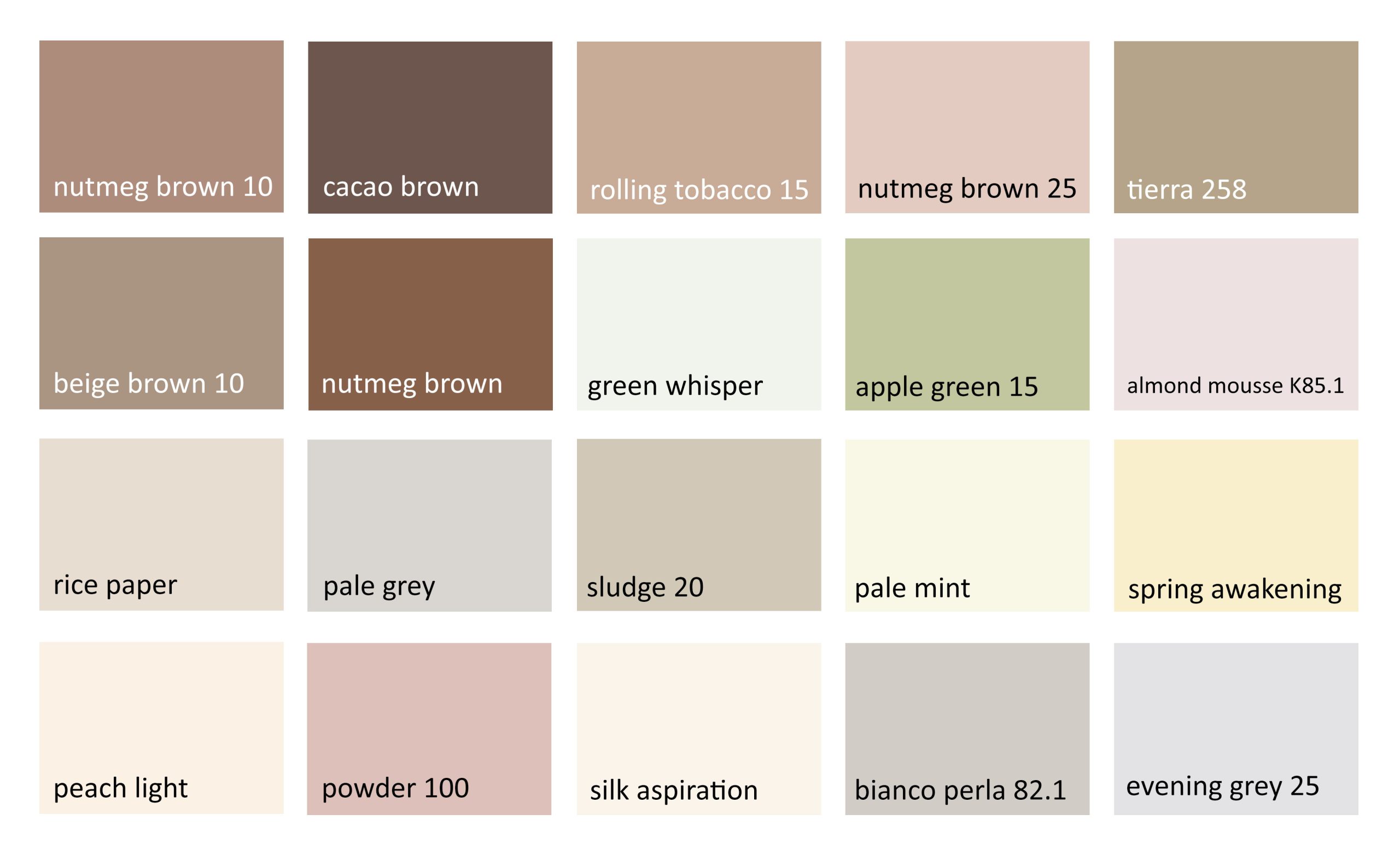
In 2025, the focus is on shades that radiate both deep elegance and natural down-to-earthness. Nutmeg brown, beige brown and cocoa brown are warm, rich shades that embody an earthy grace. In combination with strong and calming tones, these brown shades unfold their full potential and show how flexible and modern they are.
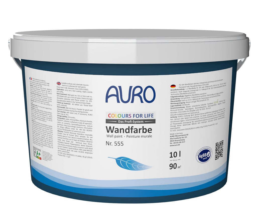
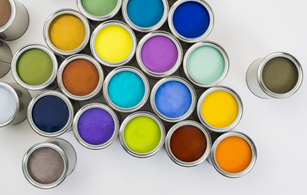
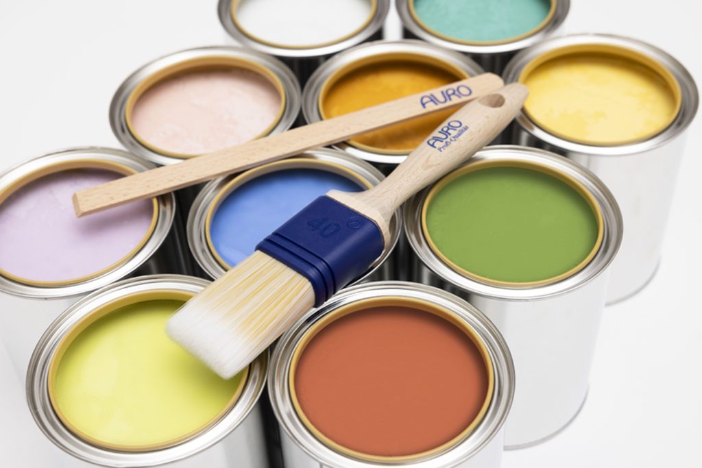
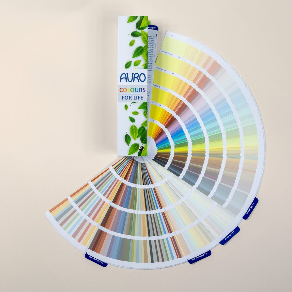
The COLOURS FOR LIFE ecological premium wall paints, clay paints andvarnishes consist exclusively of purely mineral pigments and ensure particularly authentic shades. The natural paints are available in over 1000 shades and reflect the spirit of the times in terms of sustainability and current colour trends.
The following colour palettes offer a wide range of options for creating creative contrasts and individual style accents.
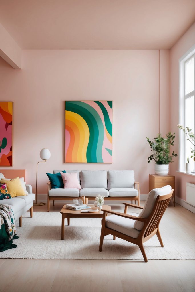
Colour collection – warm & elegant
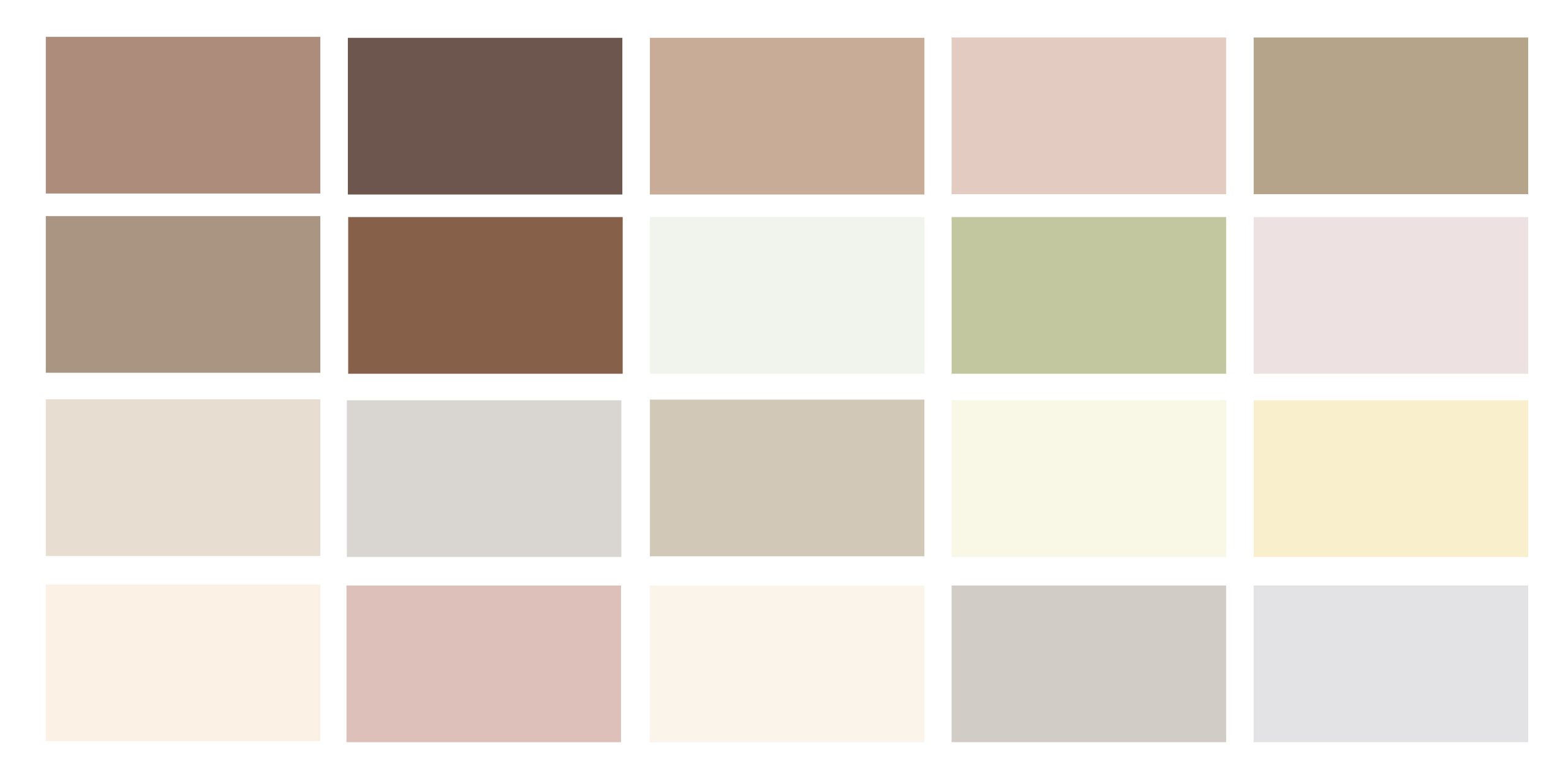
Warming, soft brown tones - a feeling of comfort and well-being
A wonderful way to bring comfort and luxury into the home. The selection of beige, cream, taupe and brown tones creates a warm and inviting atmosphere that is both elegant and down-to-earth.
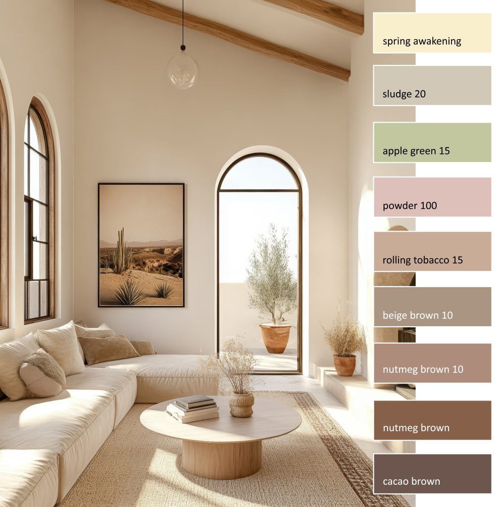
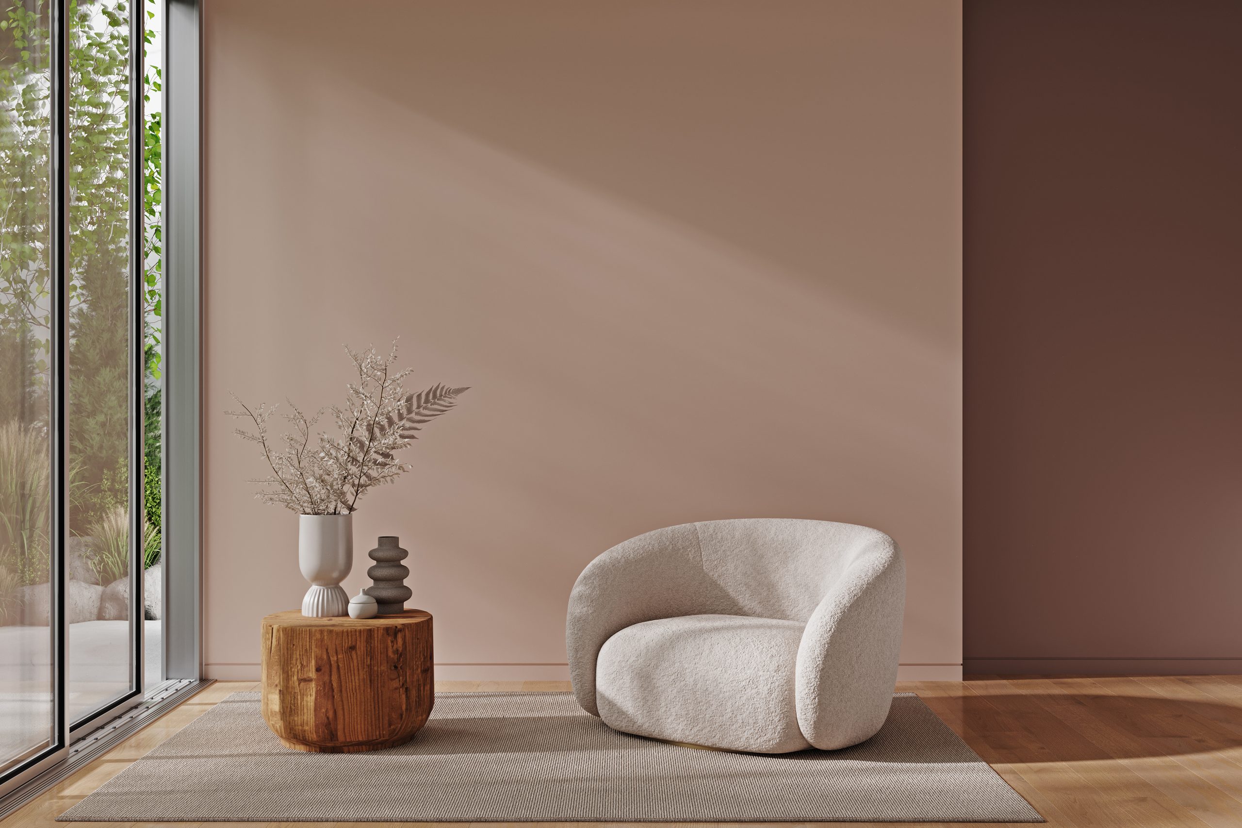
Whether in living rooms or other areas – shades of brown bring warmth, comfort and a fresh, contemporary aesthetic at the same time. They are not just a companion, but can also play the leading role in its versatility.
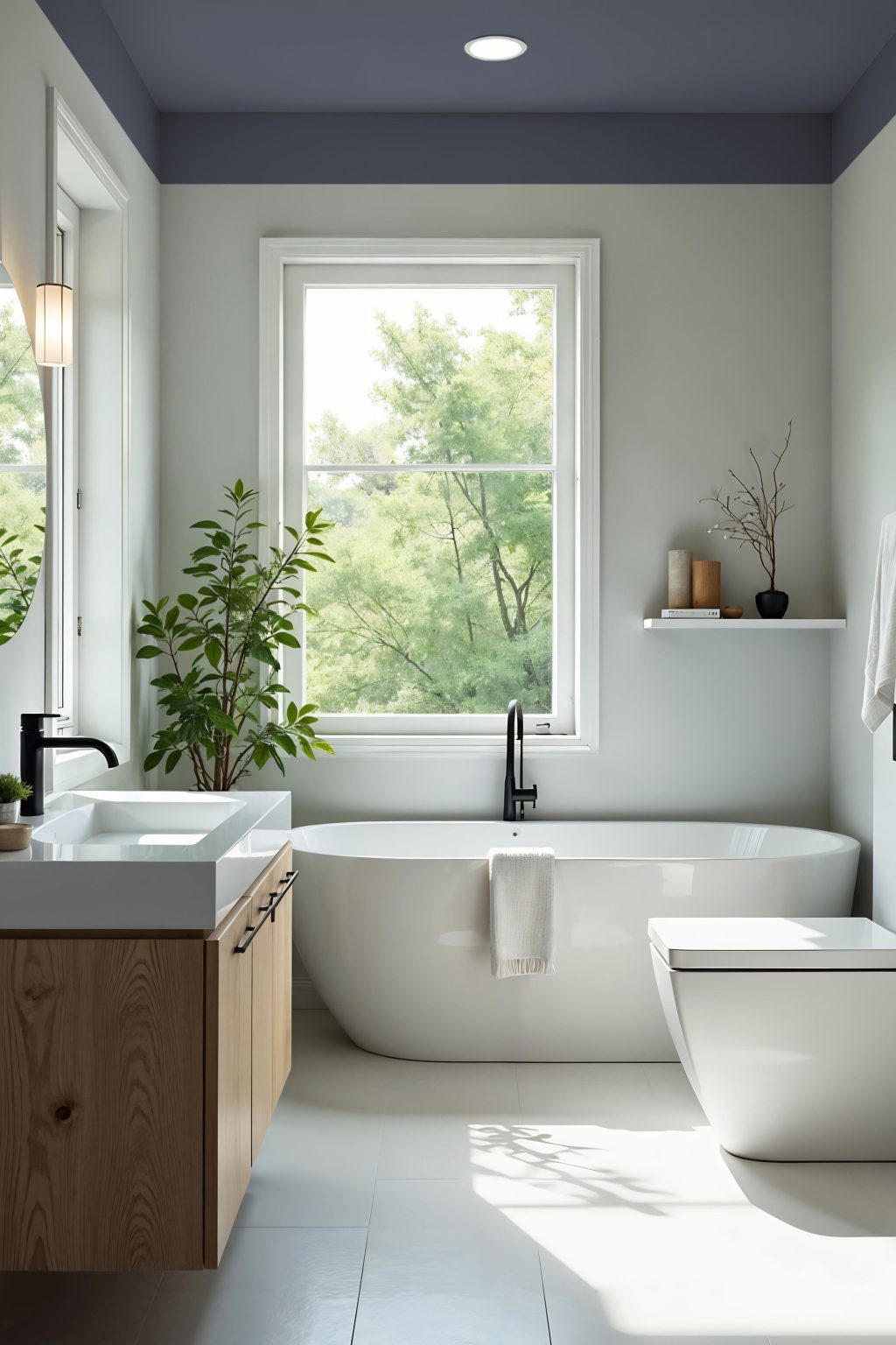
Bath: nutmeg brown 20 & powder
Study: sludge 20
Living: nutmeg brown 10 & cacao brown
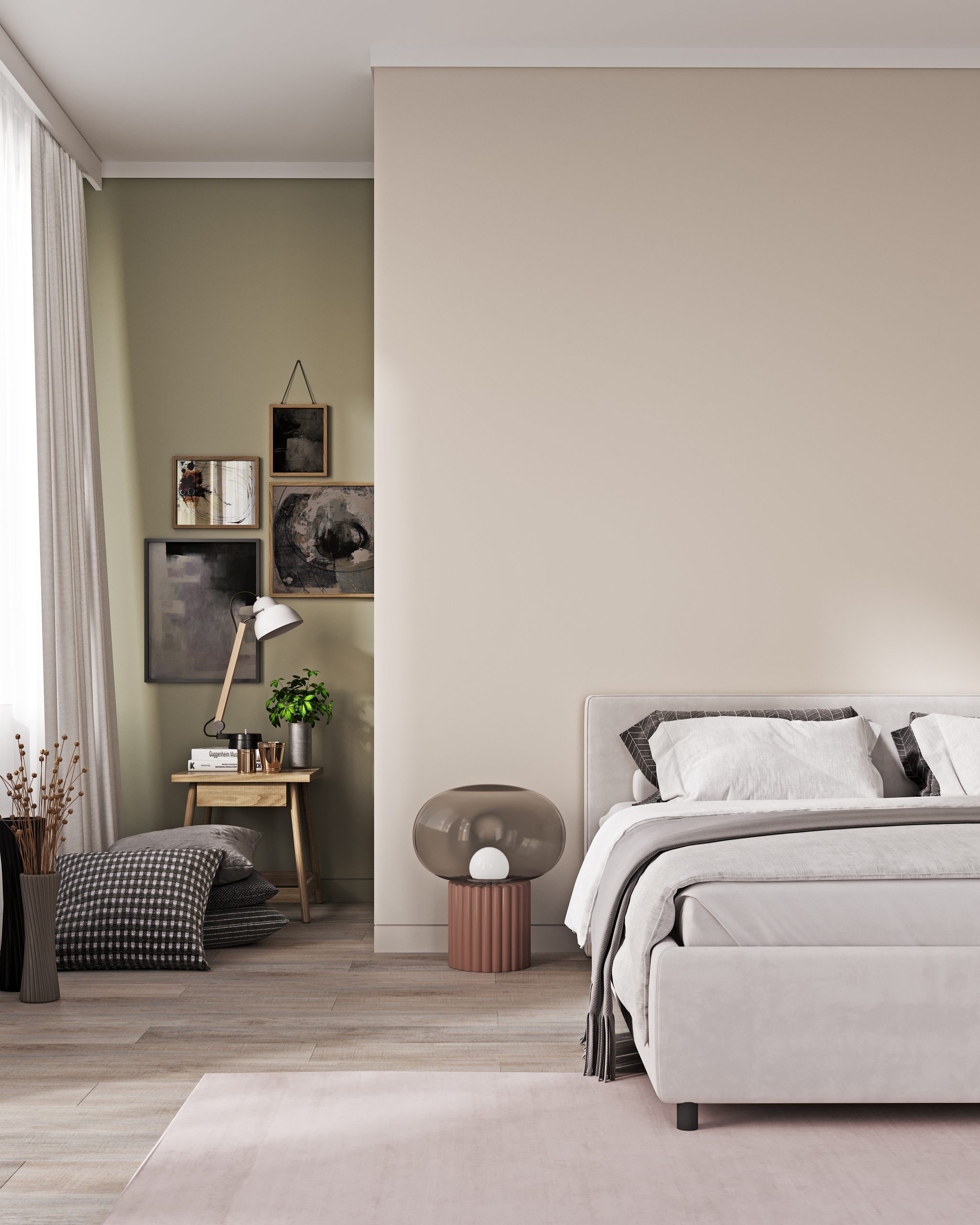
Bedroom: apple green 15 & silk aspiration
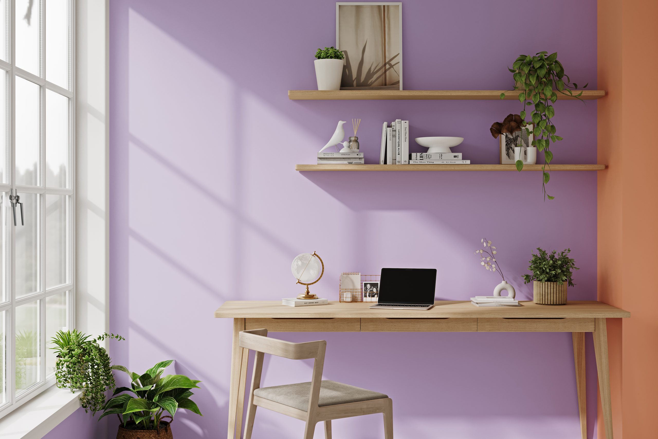
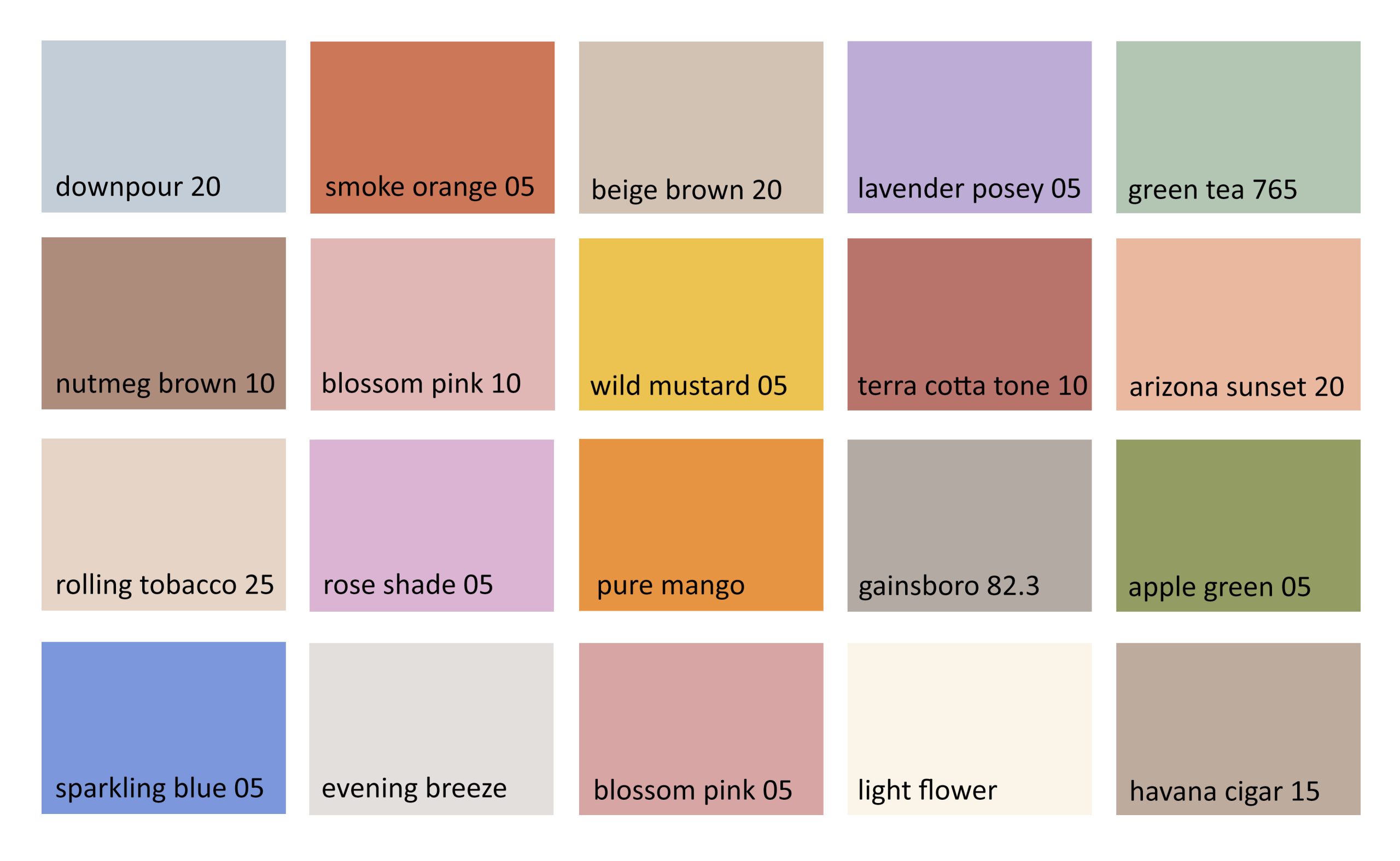
Colourful - Bright tones and cool neutrals
These modern shades radiate lightness, elegance and a contemporary style. Versatile in use, they bring a pleasant freshness to any room – for a stylish and lively home.
2025 not only brings warm earth tones to interior design, but also a fresh palette of cool shades that convey lightness, elegance and a modern touch. These colours are versatile and give rooms clarity and a touch of freshness.
Shades of brown combine effortlessly with soft nuances such as blossom pink 05 (rosé), but also stronger colours such as smoke orange 05 (orange-red), lavender posey 05 (purple) or sparkling blue 05 (blue). In these combinations, the brown shade can unfold its full potential and show how flexible and modern it is.
Colour collection – lively & fresh
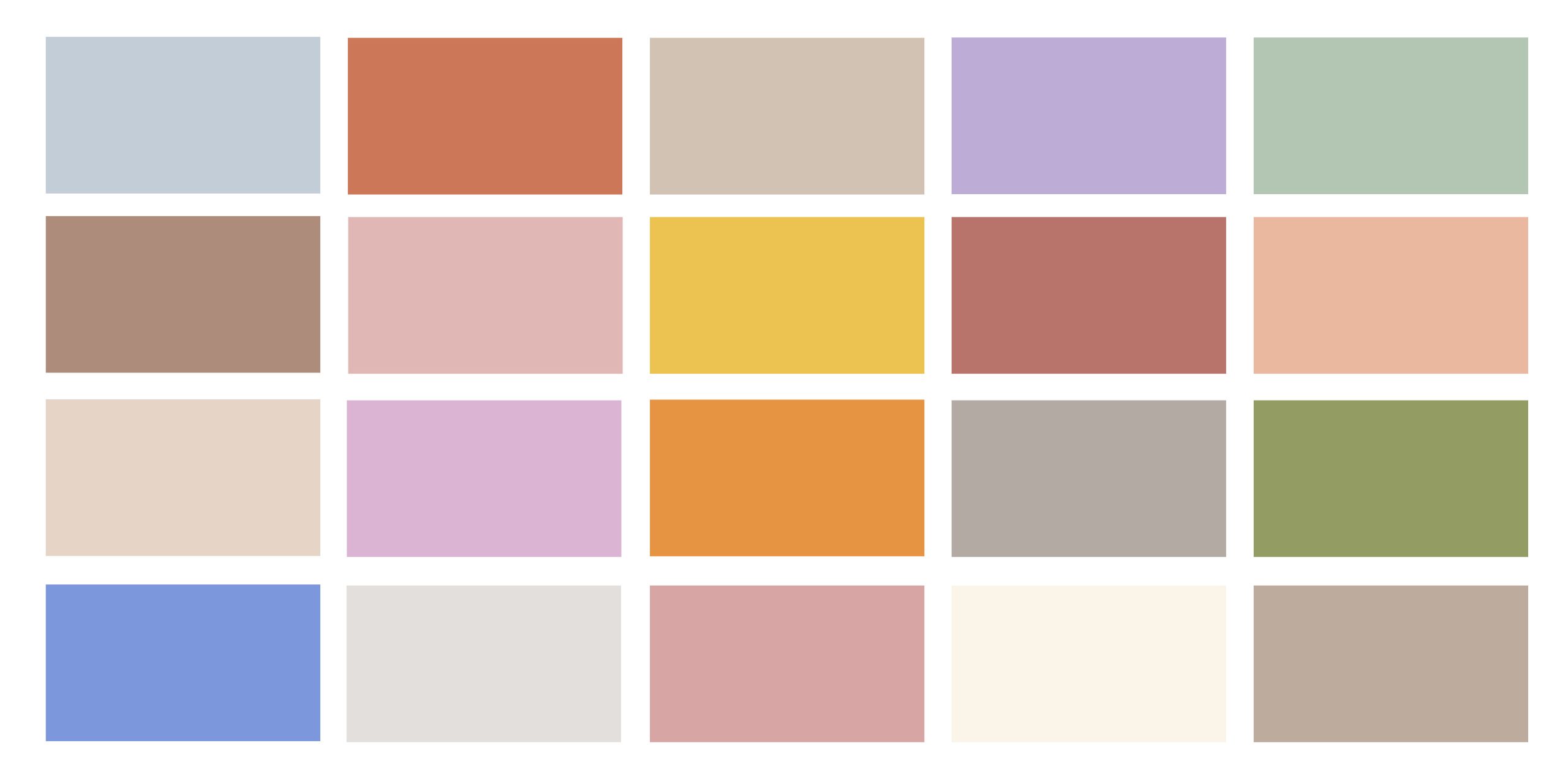
Colour collection - lively & fresh
Colourful neutral tones are particularly suitable for living rooms, bedrooms or even work areas, as they create a pleasant environment in which you feel comfortable. They are also versatile and go well with different furnishing styles – whether Scandinavian, modern or classic.
The colours convey naturalness, individuality and optimism. A spectrum of a mixture of exotic, vibrant tones, earthy mid-tones and calming neutrals. It reflects our need for authenticity and harmony with nature.
Bath 1: latte macciato & blossom pink / Bath 2: green tea 765
Kitchen 1: pure mango / Kitchen 2 smoke orange 05
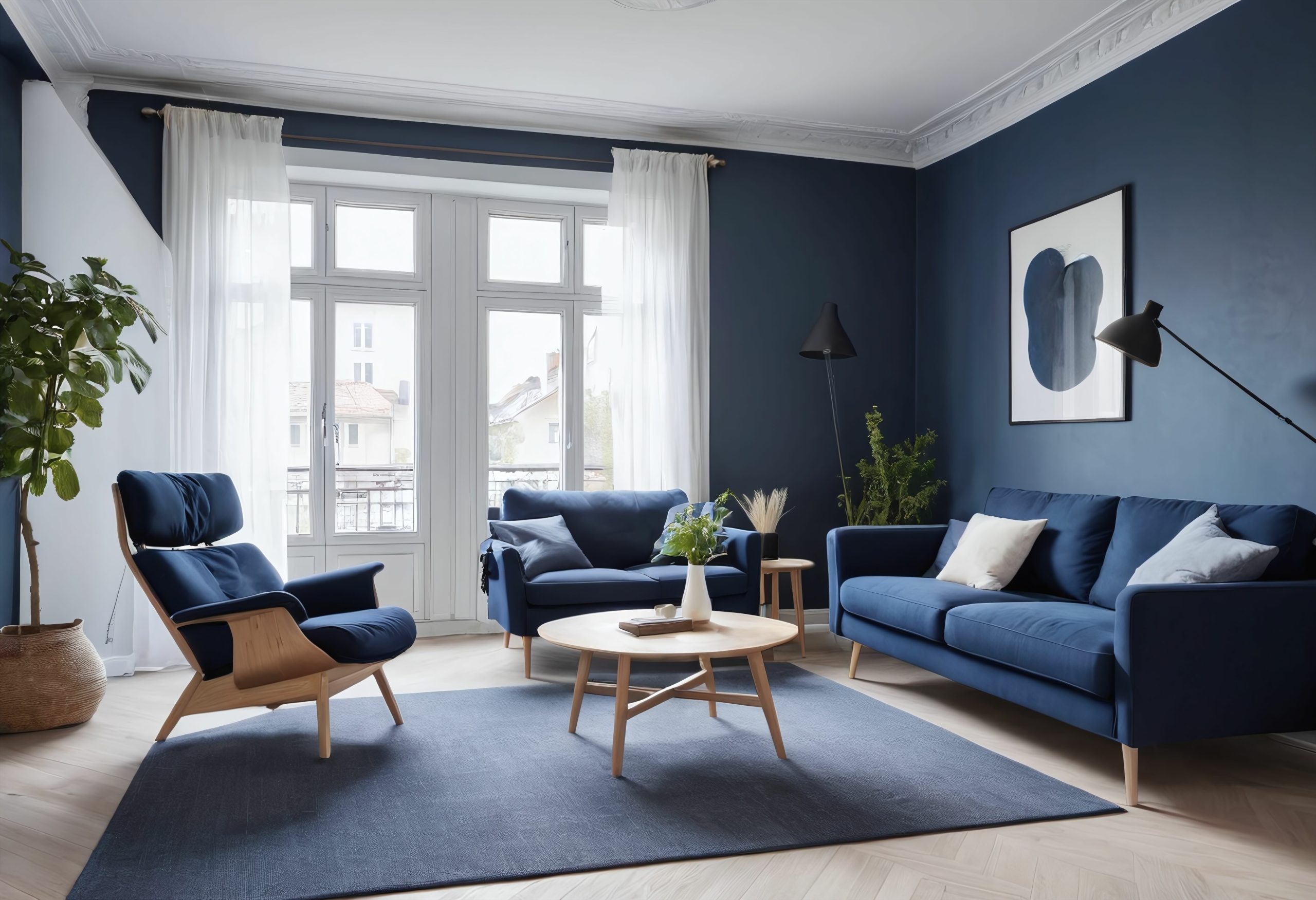
Living: havana cigar 15 & downpour
Hallway: rose shade 05
Bedroom: wild mustard 05
You can find all colours here.
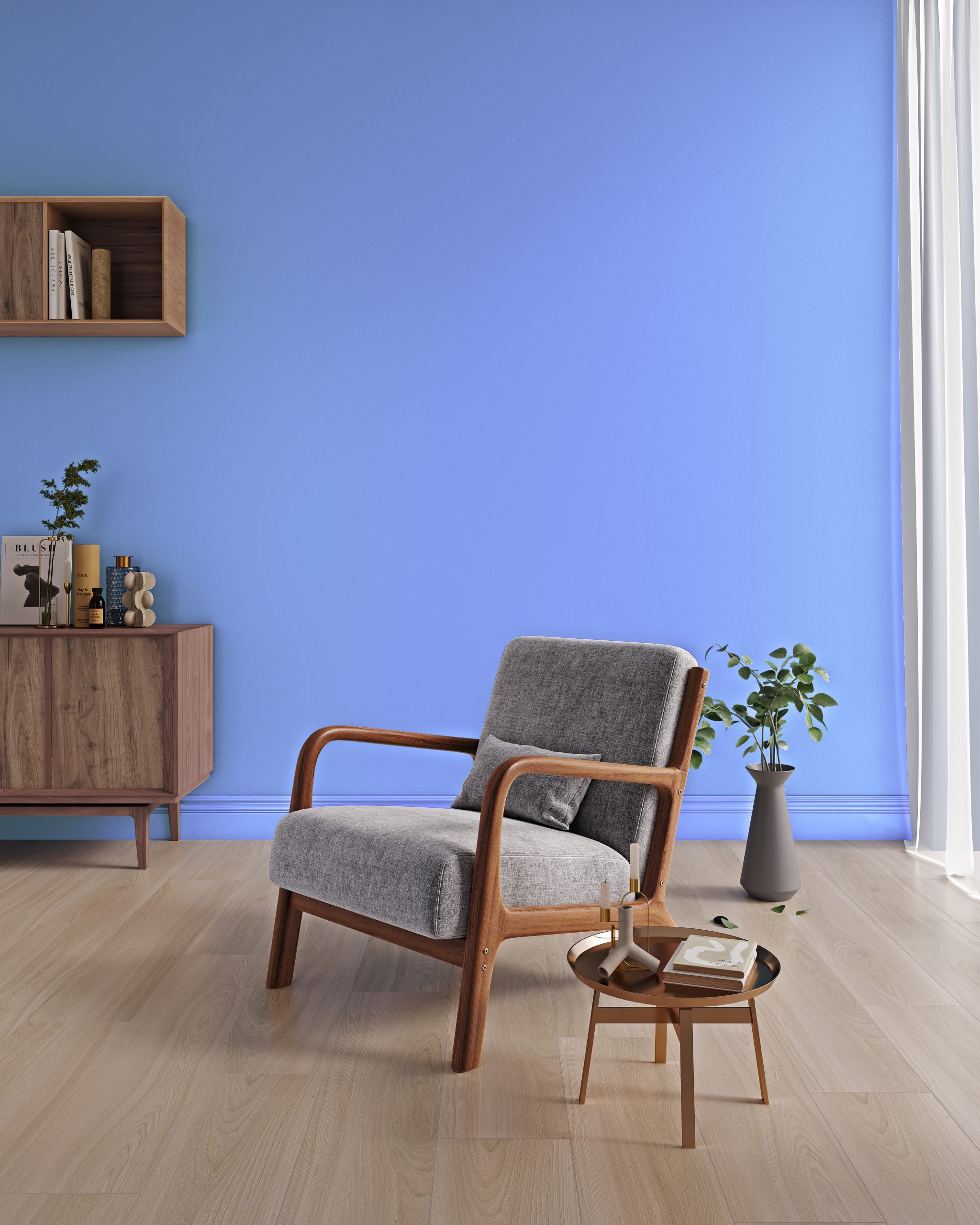
Strong tones - living with colours is a feel-good booster
Whether in living rooms or other areas – earthy, strong tones bring a contemporary aesthetic. They can not only be a companion, but also play the leading role thanks to their versatility.
Combine bold colours – With a little courage, you can give your home a very special ambience. To ensure that the strong tones harmonize, the focus should be on one or two main colors.
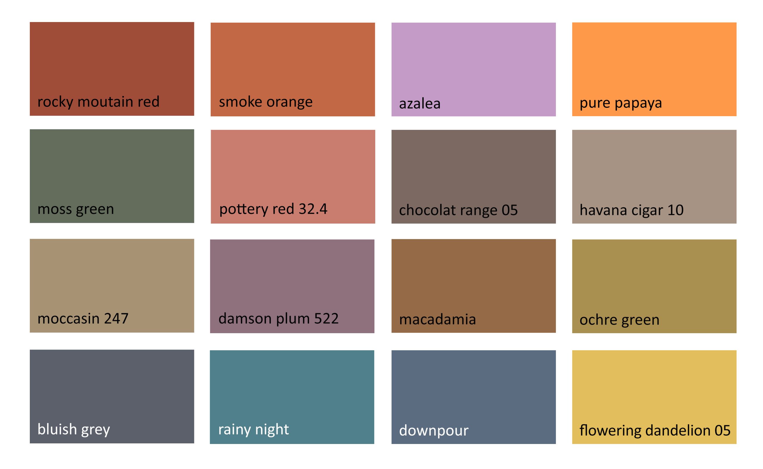
The calming earth tones emphasize a strong connection to nature while creating a relaxing atmosphere. Colours such as a strong blue (downpour and bluish grey), earthy red (rocky mountain red and smoke orange) celebrate the beauty of the environment. The strong orange (smoke orange) and matt mustard yellow(flowering dandelion 05) set cheerful accents.
Color collection – Strong tones
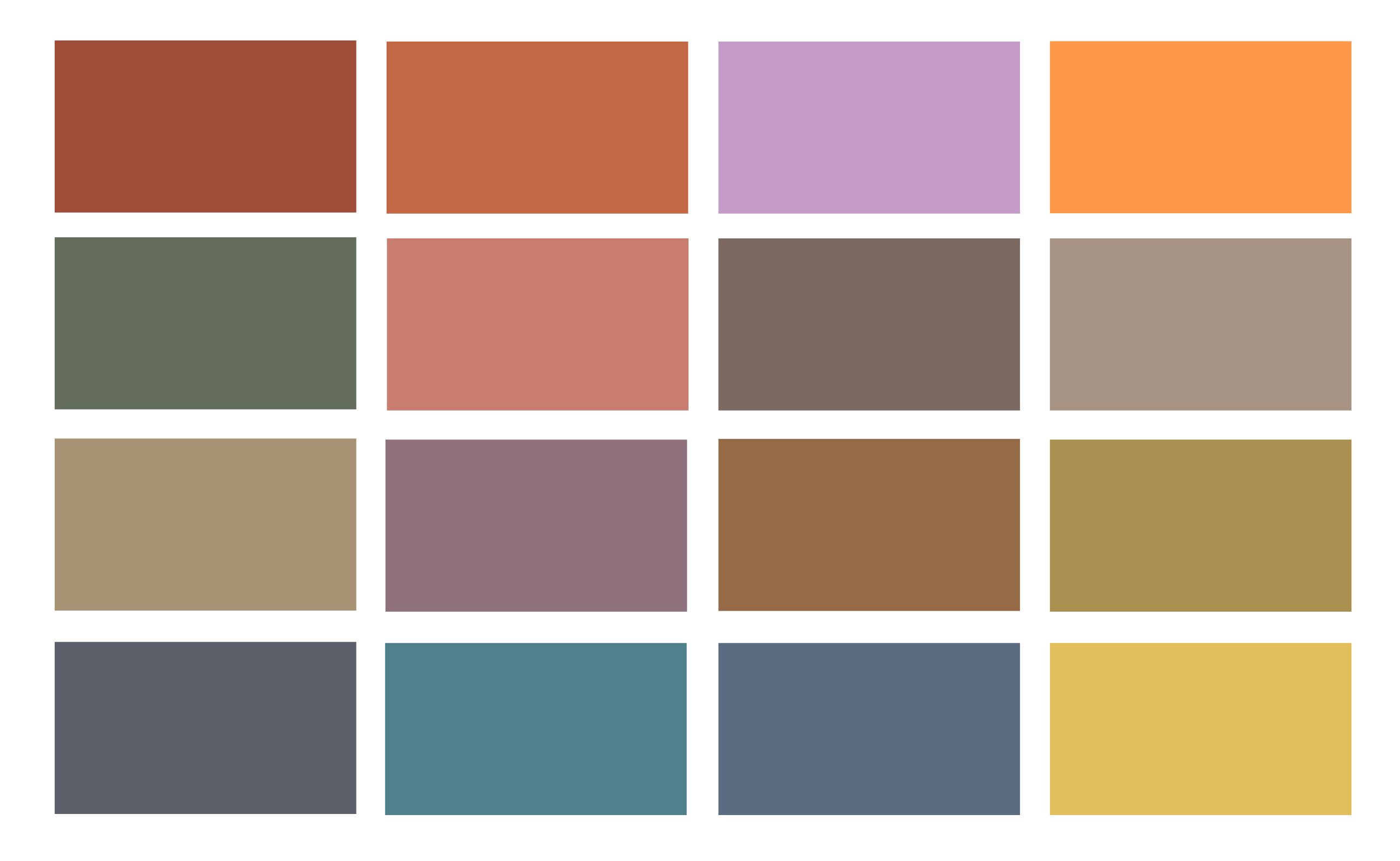
Colour collection Strong tones
Using a strong mix of colours can give a room a lively and energetic atmosphere. Combining bold colours such as deep blue, rich green, warm red or bright yellow with lots of wood creates an exciting contrast, giving the room a modern yet cozy feel.
Using strong colours of similar intensity creates a harmonious overall picture in which no single colour appears too dominant. This makes the room more lively and personal, without it appearing overloaded.
Living room 1: havana cigar 10 & downpour / living room 2: rainy night (front kitchen: farmland)
Kitchen 1: pure papaya / Kitchen 2: smoke orange
Bedroom: moss green & maccadamia
Hallway: flowering dandelion 05
You can find all colours here.
Coloured ceilings - the fifth wall
Ceilings will also become an important part of the design in 2025. However, the design should be just as carefully considered as the choice of colour for the vertical walls. Used correctly, colourful ceilings can visually divide large, open rooms into individual areas. Thanks to the nuanced colour accent, the painted fifth wall can influence the perceived height of the room.
Dark ceilings often give the room more contour and depth. It holds the room together visually like a bracket. The walls and floor are kept neutral, while the warm colour of the ceiling gives the room a cozy atmosphere. A discreet solution that brings a lot of homeliness.
Ceiling: 2.0 Suave Grey, walls and door: 3.1 Pleasant Beige, SALTYbyAURO
If the ceiling and walls are painted in the same colour, a stylish and atmospherically dense room feeling is created. The boundaries between the surfaces are visually dissolved, which is particularly advantageous in smaller rooms. This makes the room appear more spacious and cohesive. However, this often makes rooms feel boxed in and an additional dimension is lost.
Ceiling and walls: rose quartz
By using colour, a low ceiling can be visually raised to make a room appear more airy. The coloured line on the ceiling lowers the room, automatically raising the ceiling height for the eye. This gives the room additional visual height.
Cover: bluish grey
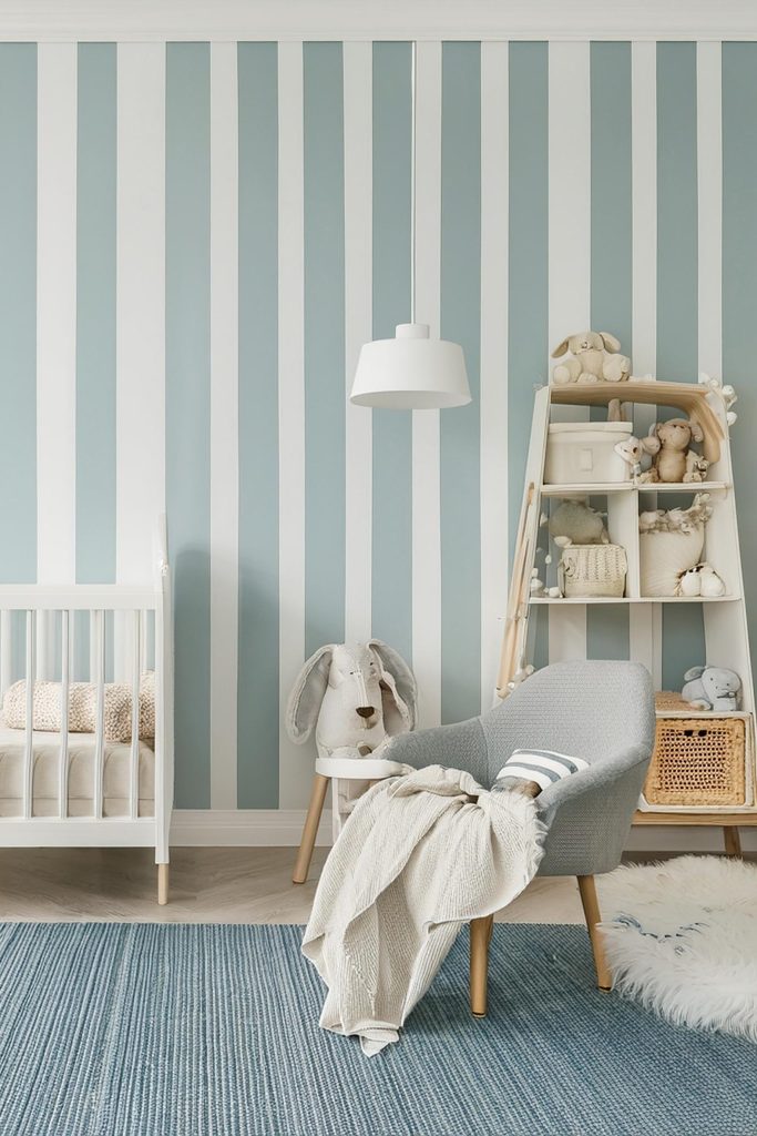
Wall with a striped look
Painting a wall with stripes is not only a popular trend, but also sustainable and cost-effective. Leftover paint can be cleverly used to add creative accents. With a little know-how, you can create individual wall designs that make your home unique.
Tip for beautiful lines: Carefully mask the wall with masking tape and press it down firmly. First paint the edges in the wall paint, then leave to dry well. When applying the paint for the stripe afterwards, the tape prevents the paint from running underneath and the edges from fraying so that the result is nice and clean.
For a longer, elegant hallway: vertical stripes make the room look longer and create an elegant and modern atmosphere. The horizontal ceiling strips, on the other hand, create a calming and cozy atmosphere that makes the room more pleasant.
Colour: reseda green 05
Photo: Rock the heirloom_ photo_Cathy Pyle
Stripes do not always have to run strictly parallel to each other. Irregular stripes, for example, can be used for wall design with stripes. They create an interesting look.
Colour: blue blossom
A creative way to divide up a room: Beautiful accents can be created with stripes on the wall, they are a great way to highlight certain areas in the room. For example, a cozy reading corner in the living room.
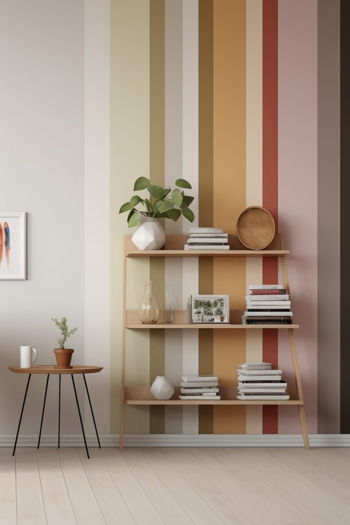
Colours from left: quicksilver, white, young hops, 284 khaki, greige, white, forest clearing, 10.7 maize, 10.1 corn, indian summer 05, K45.4 malva, chocolat range 05, 99.8 black magic (full tone)
COLOURS FOR LIFE Premium wall paint, clay paint, varnish and wood stain
The best choice in terms of quality and sustainability: The COLOURS FOR LIFE line is characterized by the consistent ecological selection of raw materials and compliance with the strict AgBB criteria for emissions. These paints are particularly recommended for the home. All shades are easy to apply, have excellent coverage, are drip and splash resistant and ensure a perfect painting result. The colour shades are therefore emission-free and also suitable for households with allergies.
Colour selection in over 1000 shades
Select the COLOURS FOR LIFE shades with living examples and further information.
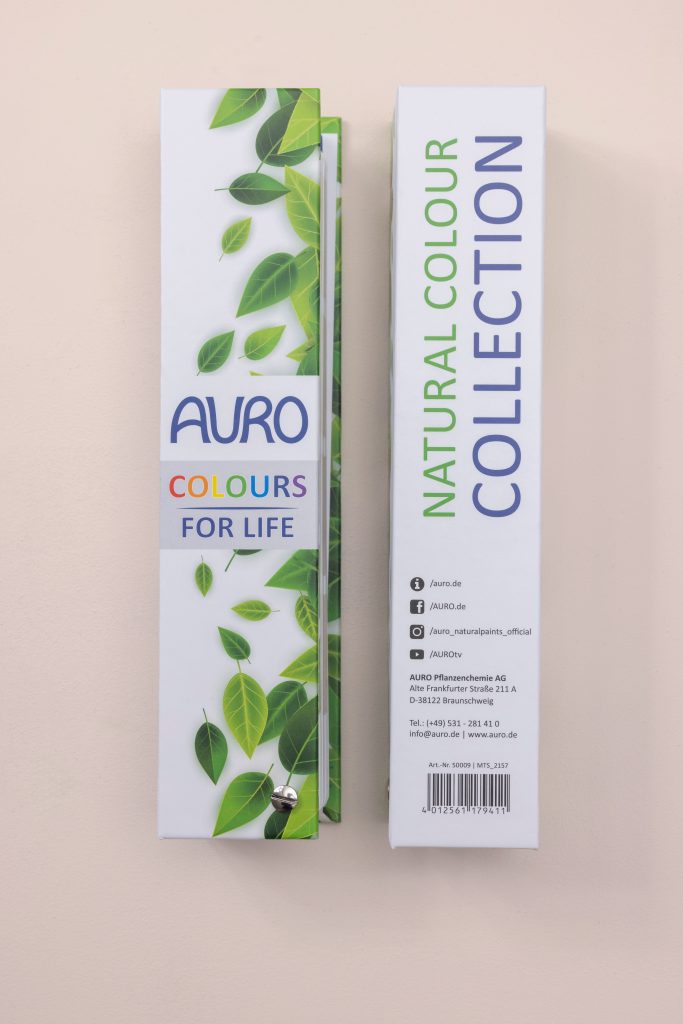
Colour fan on site at the dealer
You can also find all shades in the COLOURS FOR LIFE colour fan at your retailer near you.
Auro products
You can find more information and the full declaration on the product pages.