2026
Trend colours
A new closeness to nature - colour & interior trends 2026
The 2026 colour trends are based on what grounds and invigorates: earth, plants and light. Warm earth tones, balanced shades of green and blue as well as accents in plum, yellow and orange characterize the new colour world. Delicate pastel shades and a soft, creamy white ensure lightness and balance.
Colour is once again becoming a design element. It creates atmosphere, brings personality into the room and makes individual living visible. Natural materials, textured surfaces and a conscious use of resources underline the desire for rooms that radiate calm and convey a real sense of well-being.
AURO colour experts
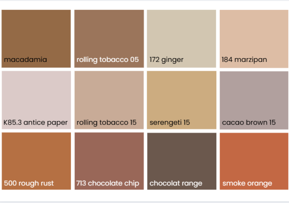
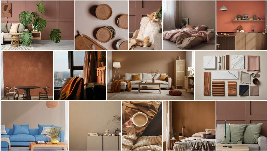
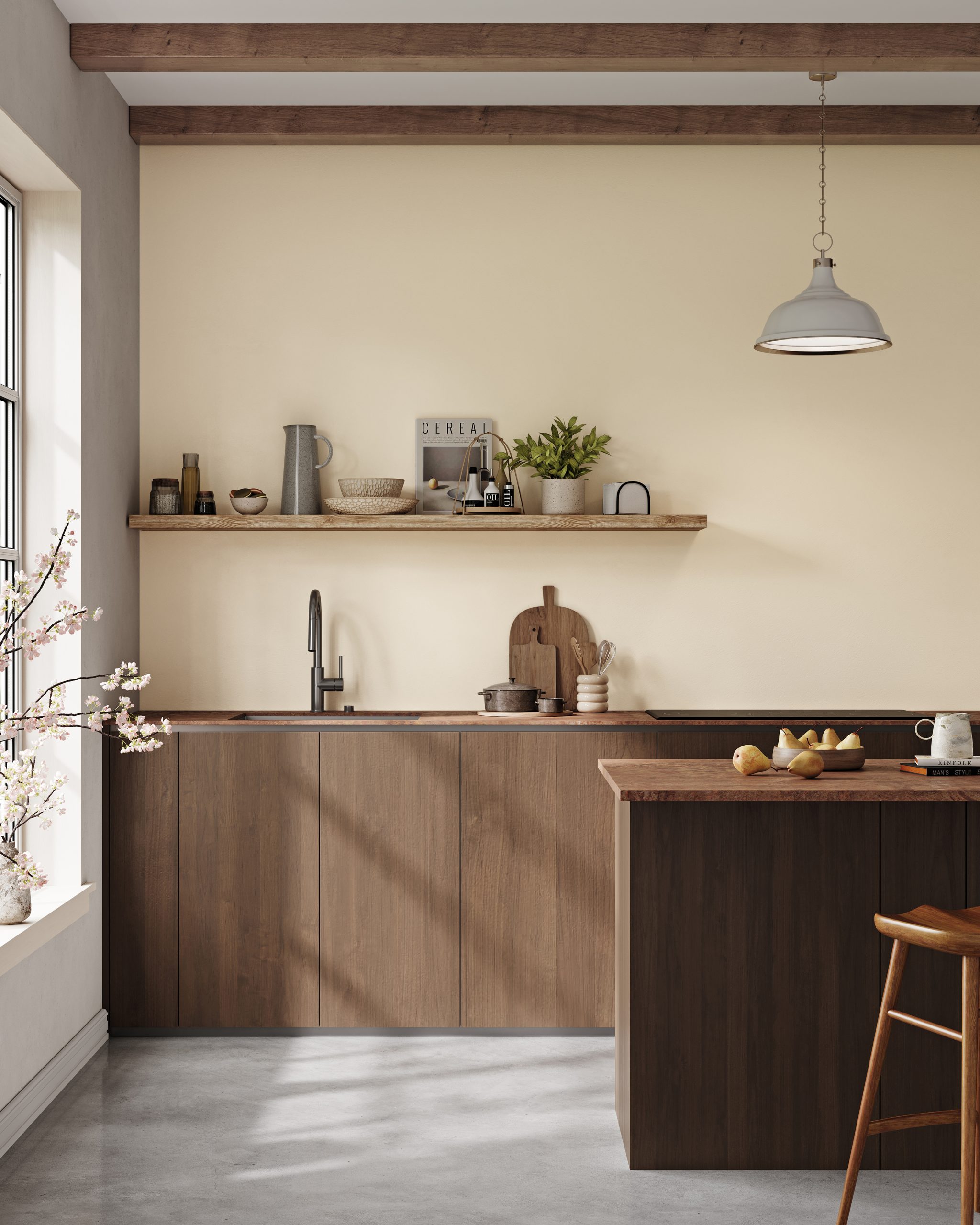
Warm brown tones characterize the colour trends 2026
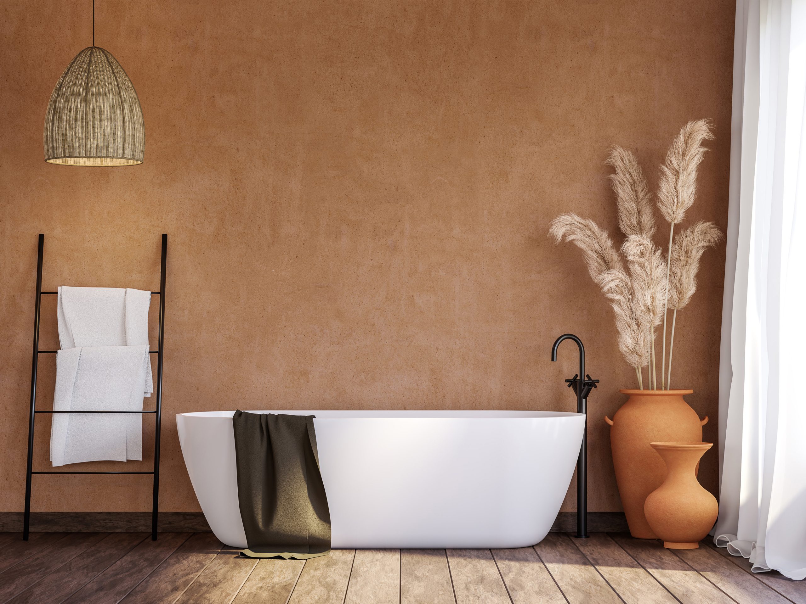
In 2026, brown is finally establishing itself as the defining key colour of current colour trends. It has long since left its purely classic image behind and now presents itself in a diverse, modern range – from soft cocoa tones to rich chocolate brown. The result is a world of colour that radiates warmth and tranquility while conveying strength and character.
Colour trends brown tones
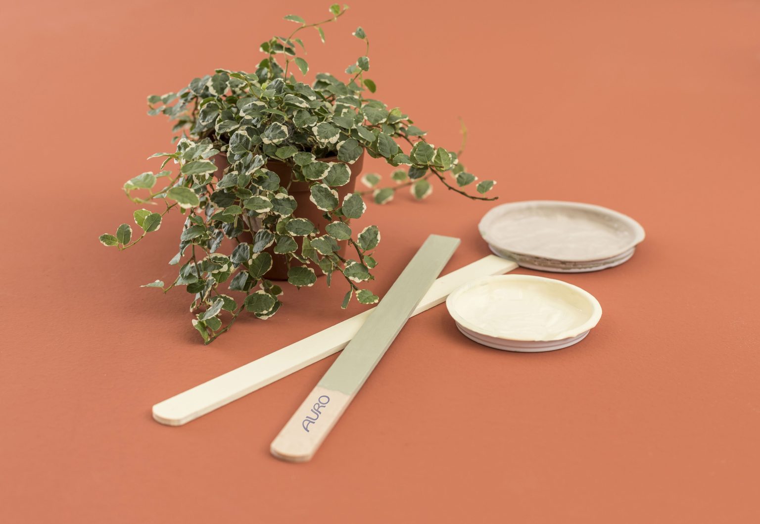
The ecological premium wall paints, clay paints and wood paints COLOURS FOR LIFE are based on purely mineral pigments and produce colours that look natural, vibrant and authentic. Over 1,000 carefully coordinated shades open up creative freedom and reflect the spirit of the times – characterized by sustainability, mindfulness and the desire for timelessly beautiful rooms. Wooden floors can also be treated with the new DuraQuick hard oil hard oil in six colour nuances quickly and sustainably.
Earth tones – In combination with natural materials such as wood in warm, rich shades, brown nuances unfold their full effect and lend rooms depth and authenticity. Complemented by earth tones such as ochre and terracotta, a calm, harmonious atmosphere with natural radiance is created.
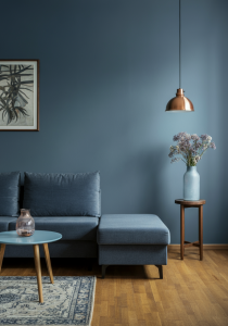
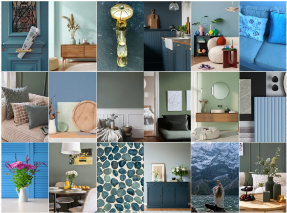
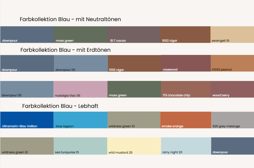
Nature-inspired shades of green and blue
Peace, depth and naturalness
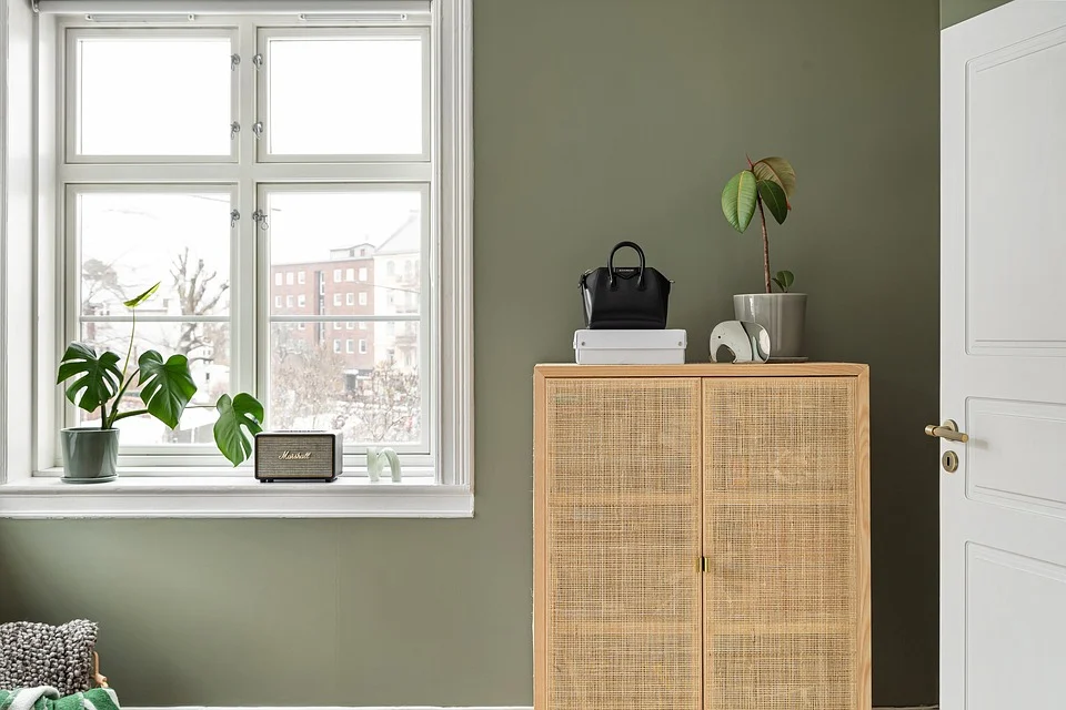
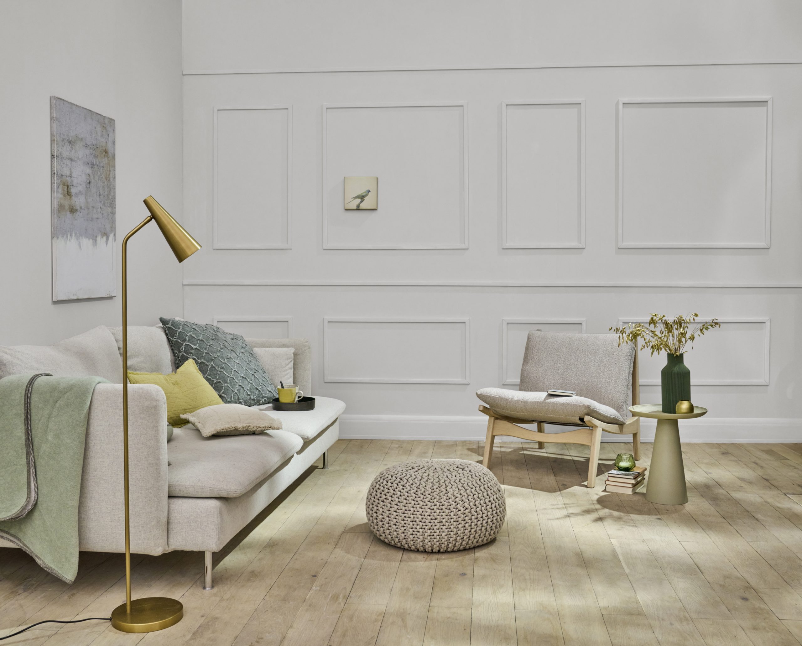
Soft green tones such as moss, olive or sage green will remain central in 2026. They have a grounding effect, promote a balanced feeling of living and underline the desire for naturalness and sustainability – values that have always been central to AURO.
Shades of blue will also characterize interior design in 2026: from deep indigo to soft petrol to light misty blue. As a wall colour, they create deceleration, depth and a calm, natural living ambience – for rooms in which you feel comfortable in the long term.
Kitchen: sea turquoise 15
Kitchen unit with picture: downpour 05, wooden floor with DuraQuick oiled walnut
Living room: moss green
Colour trends green and blue tones
The 2026 colour trends focus on muted, nature-inspired nuances that bring calm and depth to the room. In combination with warm neutrals such as cream, sand or light taupe, green and blue tones look balanced and timeless. Darker accents – such as walnut, smoked oak or dark metal – create targeted contrasts and lend the room structure and elegance.
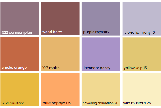
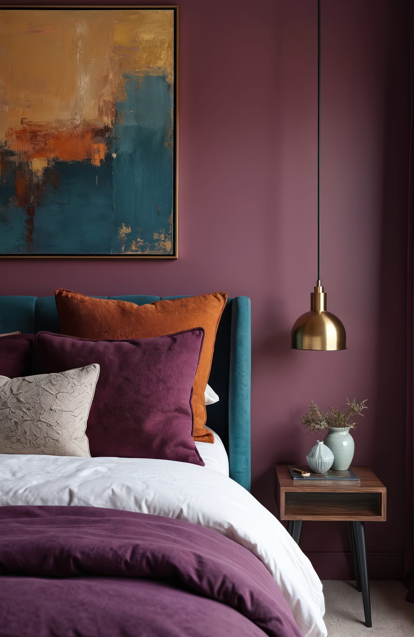
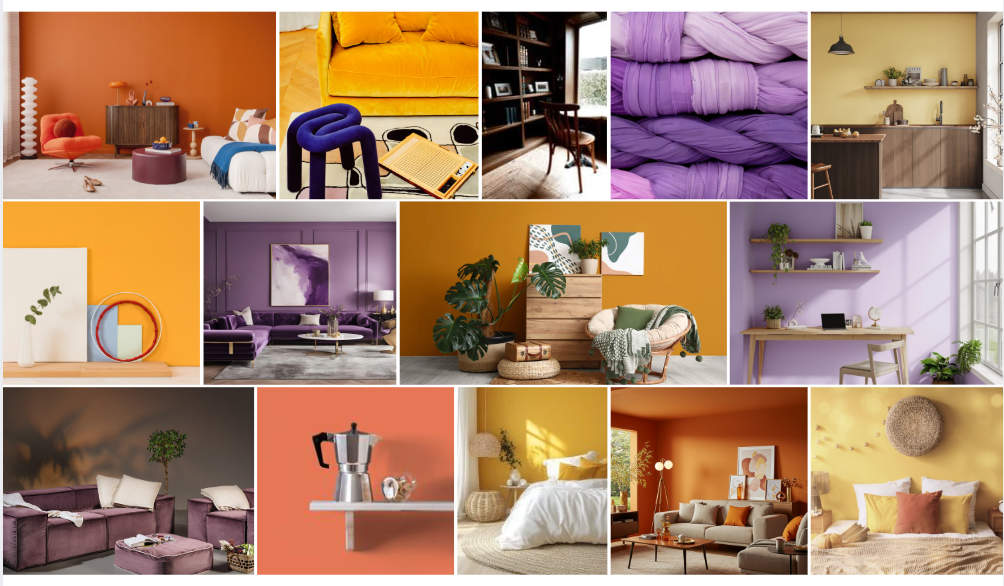
Plum, yellow and orange: colours with depth and warmth
Colours that ground and enliven rooms
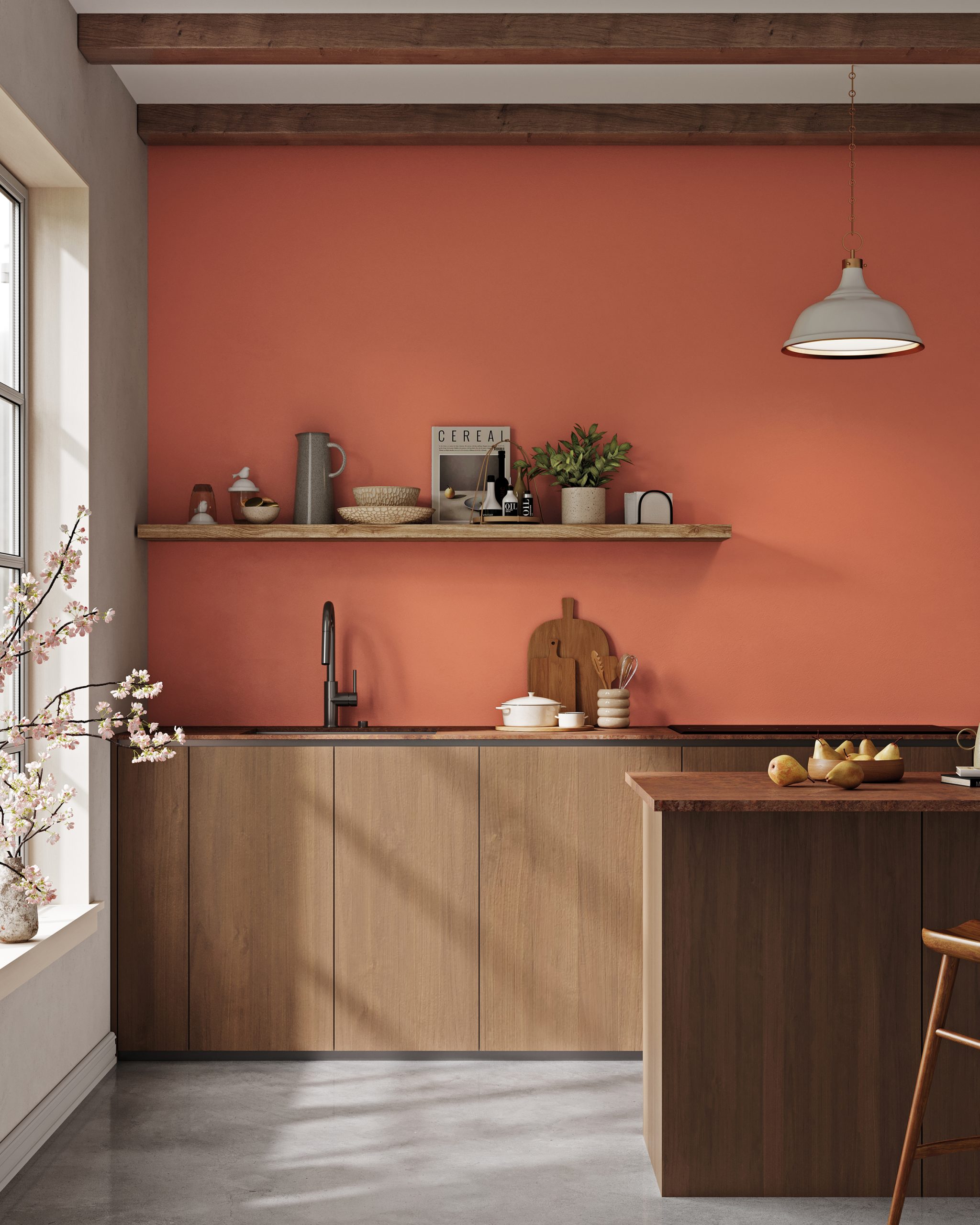
Plum & warm yellow tones define the 2026 colour world, complemented by an expressive palette of green and red tones. Deep nuances such as burgundy (wood berry), rosy rust with subtle hints of orange (smoke orange) and dark purple and plum tones (522 damson plum) lend rooms warmth, depth and character. They create a tangible grounding and at the same time set powerful, emotional accents – for living spaces with atmosphere and personality.
Kitchen: smoke orange 05
Kitchen/dining area: 522 dampson plum, wooden floor with DuraQuick oiled oak
Wall chest of drawers: wood berry, wooden chest of drawers with DuraQuick oiled oak
Colour trends plum & warm yellow tones
All available shades at a glance
All available violet, orange and yellow shades at a glance
Plum and Burgundy are ideal for living and dining areas where atmosphere and depth are required. In the bedroom, they have a particularly calm, protective effect when used in a targeted and measured manner. As an accent wall or in combination with soft textiles, they create a sense of security and a sensual, relaxed atmosphere that turns the room into a retreat. Warm shades of yellow and orange bring light and energy to hallways, kitchens and work areas.
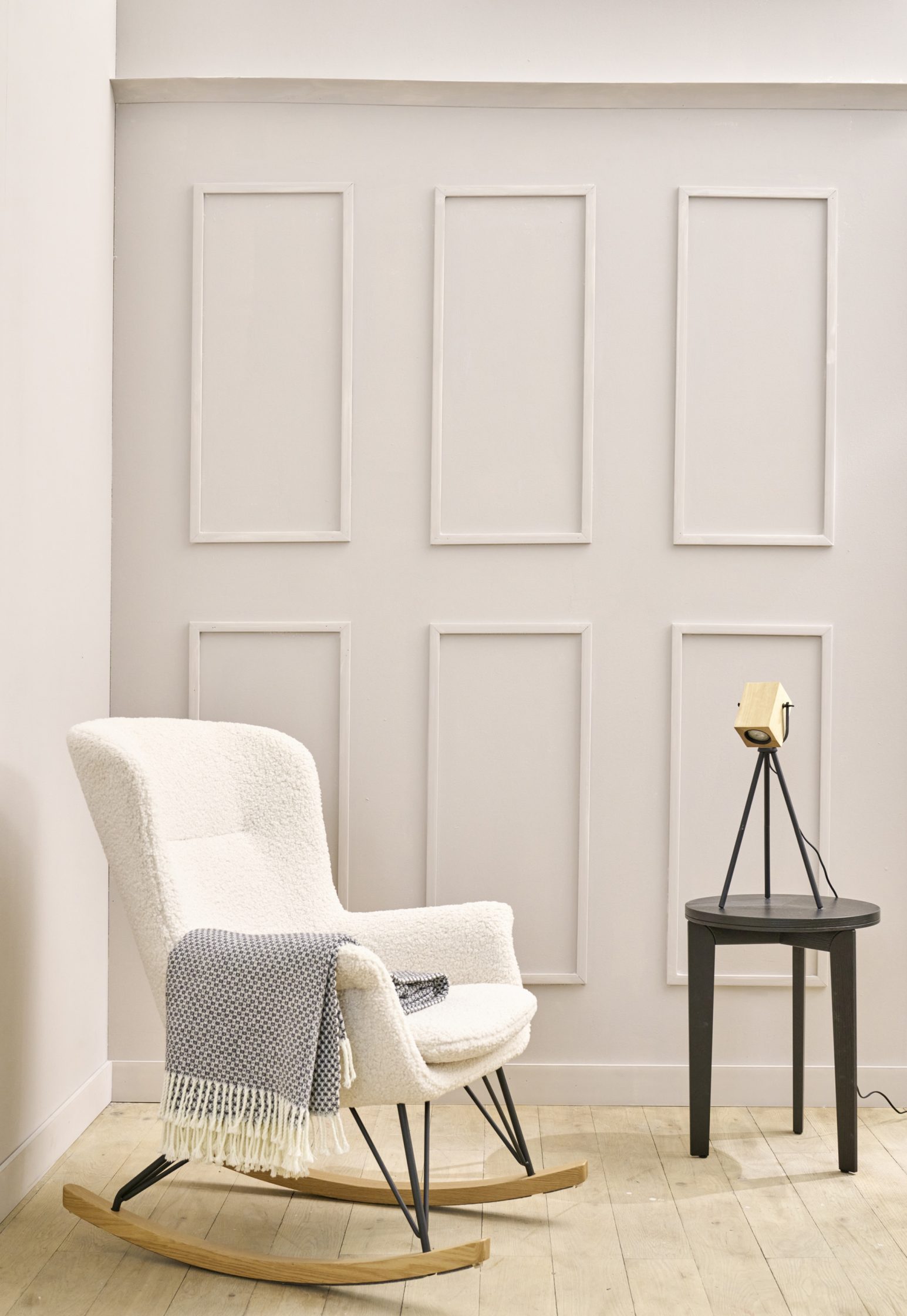
Fine pastel shades - colours of balance
Lightness in colour
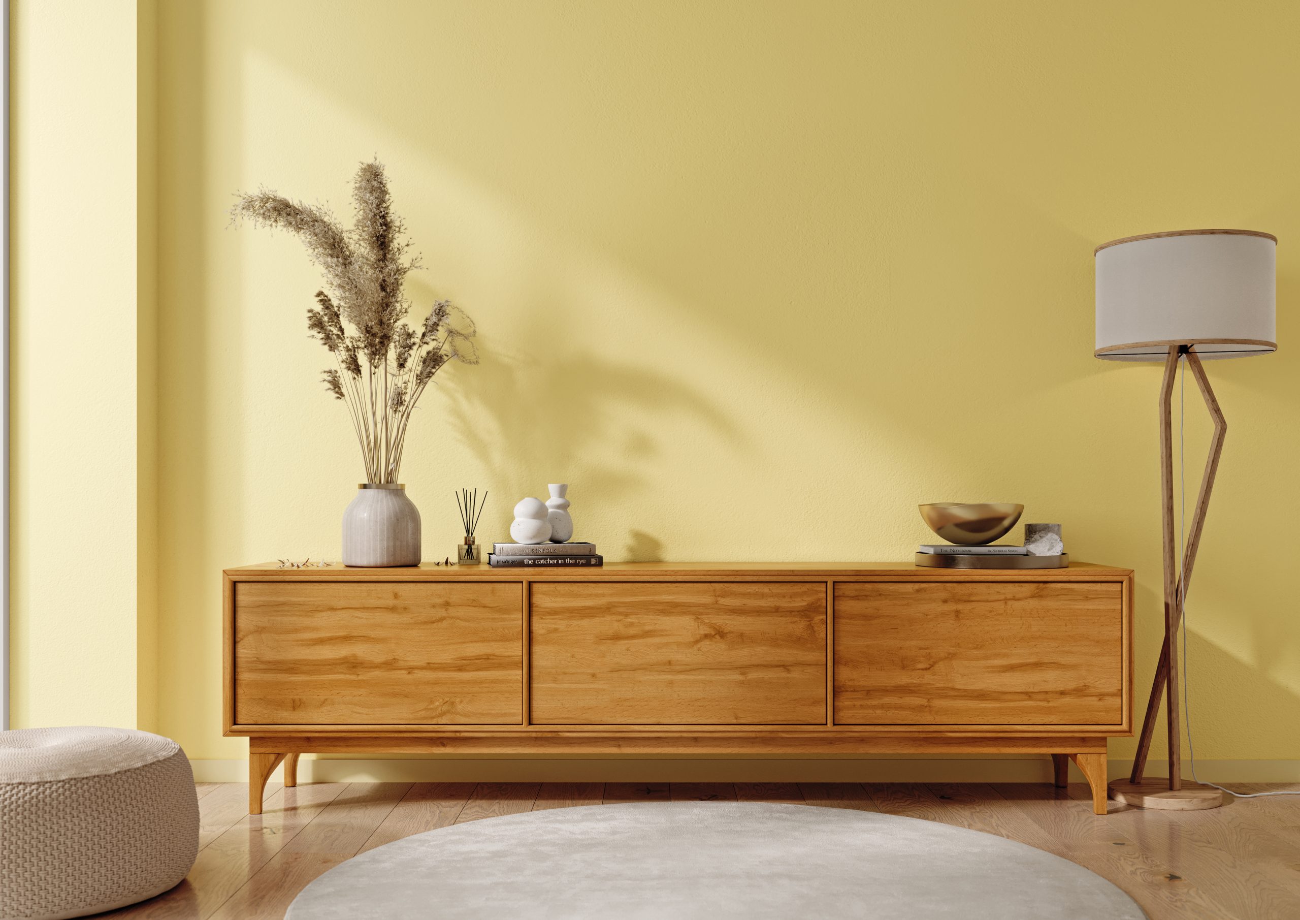
Delicate pastel nuances bring a subtle freshness to the room and are experiencing a new appreciation in 2026. Colours such as pistachio, aquamarine, soft rosé, lavender, sky blue as well as butter yellow, vanilla or peach and apricot have a light and restrained effect without being obtrusive. As a wall colour, they create a calm, friendly atmosphere and underline a contemporary, natural living style.
Living room: pale ivory
Colour trends Fine pastel shades
Whether harmoniously combined with each other or in combination with neutral colours such as white, grey or beige: pastel colours are timeless, calming and make rooms appear larger, brighter and balanced – ideal for relaxed, modern living. Pastel colours look particularly harmonious in combination with natural materials such as light wood or fine metal accents, such as brass.
Soft pastel shades - lightness for modern living spaces
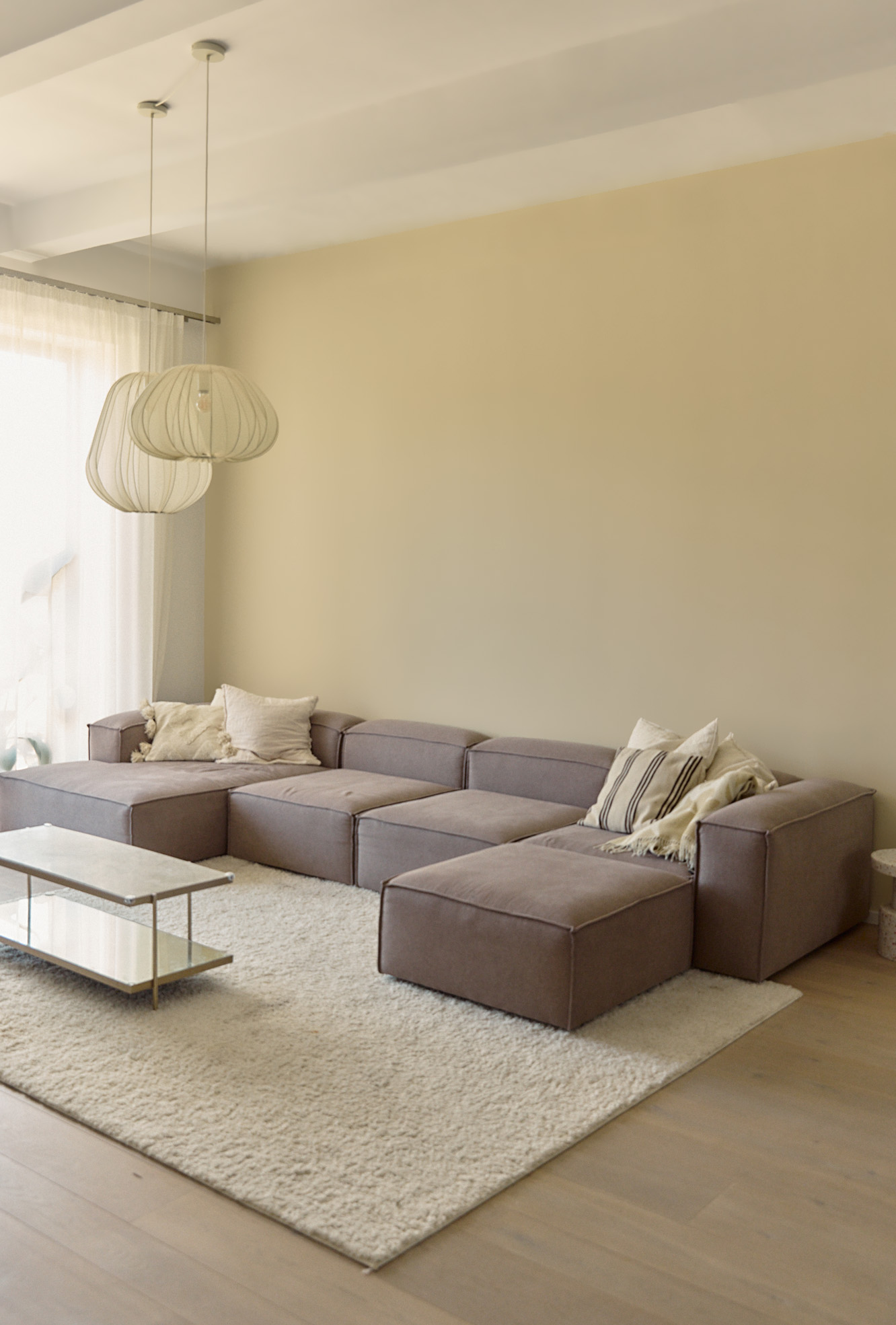
Quiet elegance in white
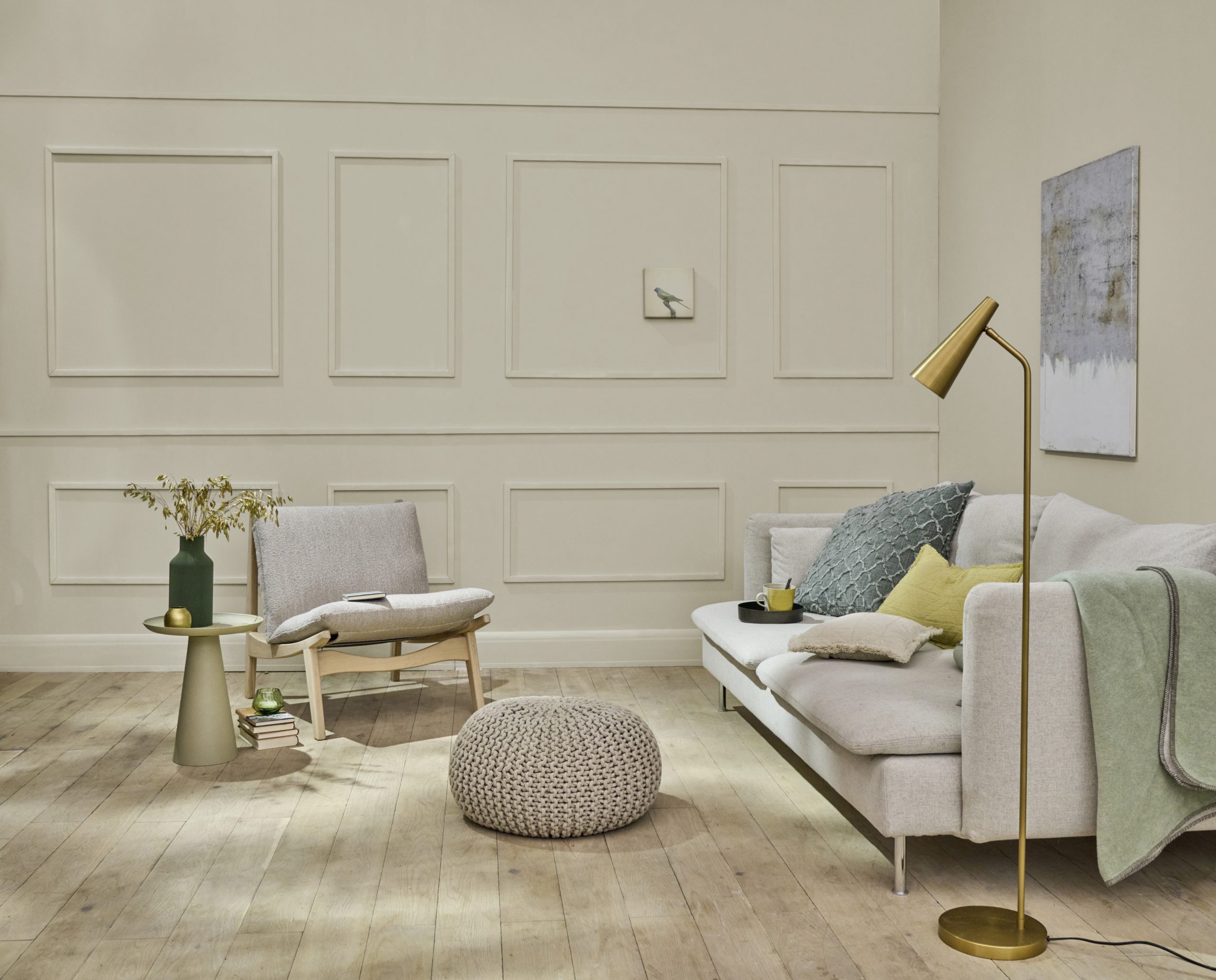
Soft, creamy white tones characterize a new form of restraint in 2026. They appear calm and clear without appearing cool and create an atmosphere of lightness and balance. As a modern neutral tone, they form a harmonious basis for natural materials, warm earth tones and subtle colour nuances.
Whether as a wall colour or in the overall design: this new white lends rooms timeless elegance and supports natural, conscious living – calm, open and permanently beautiful.
Living roommer: softy lit
Living room: whispy
Colour trends Neutral tones
Neutral tones define a living aesthetic of clarity and lightness in 2026. Delicate shades of white combine with warm beige and ivory tones, taupe and subtle shades of brown to create a calm, elegant world of colour. Especially in matt, discreetly textured surfaces, these colours reveal their depth and create an atmosphere of restraint and security. As a harmonious base, they open up space for targeted accents in bordeaux, petrol or natural green tones – for timeless interiors with balance and character.
Living close to nature 2026 - responsibility becomes the standard
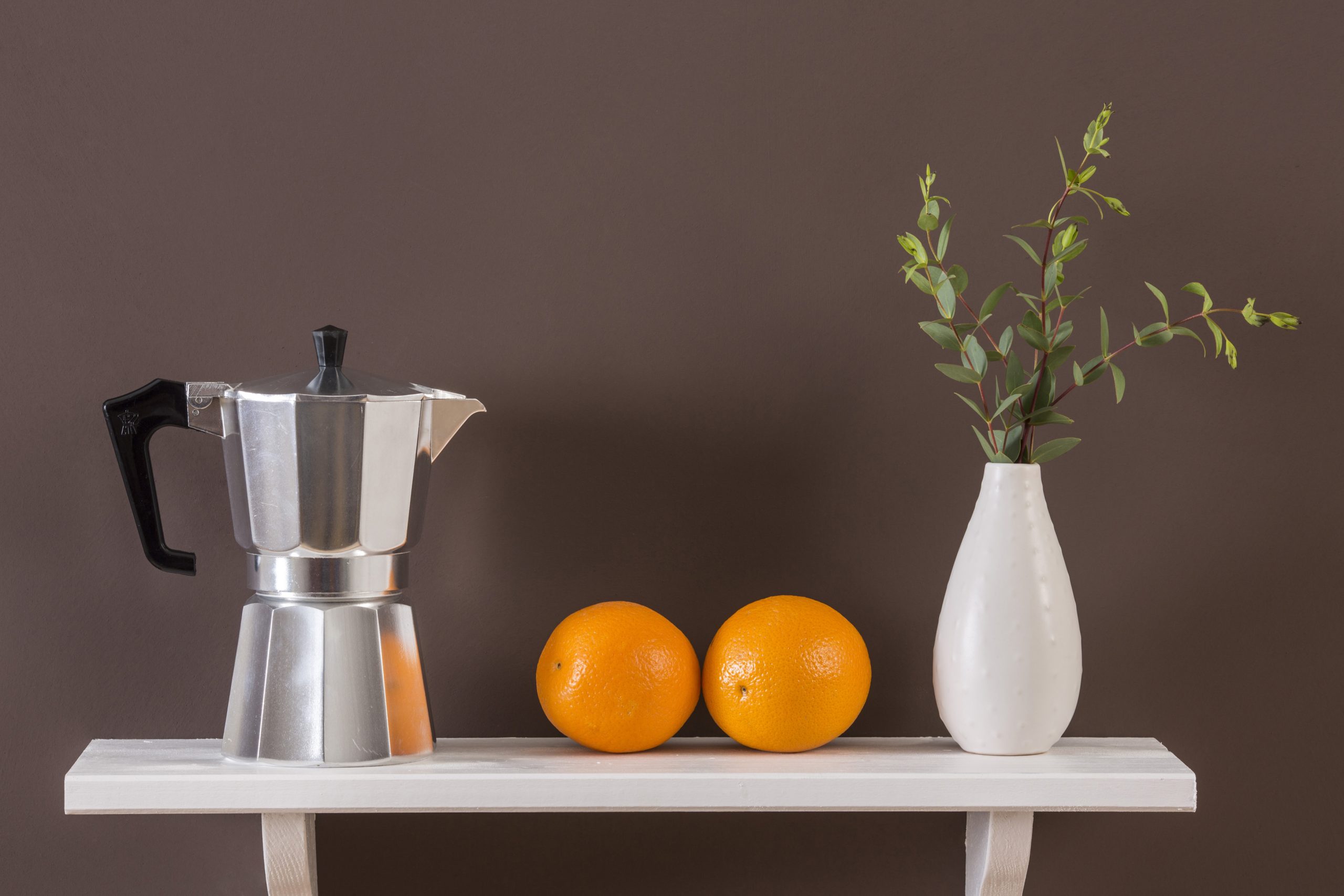
In 2026, living close to nature is more than just a style – it represents a change in awareness. Rooms should convey calm, allow sensuality and focus on health and a sense of space. Design becomes an attitude and takes responsibility for materials, indoor air and well-being.
Ecological principles are increasingly shaping interior design. Sustainable materials, natural surfaces and low-pollutant paints are now a prerequisite for contemporary living. Low and zero-VOC products are exemplary of this claim.
AURO has been following this path for over 40 years. Paints and laquers on a vegetable and mineral basis, strict emission tests according to AgBB criteria and the complete declaration of all ingredients are a matter of course.
Living close to nature is a conscious decision for rooms that are good for people and nature in the long term. AURO develops paints for precisely this requirement. Today. And long before that.
Colours: soft red brown 20, arizona sunset 25, K 85.3 antic paper, yellow gold, yellow gold 10, K 65.5 mint chocolate, K 65.6 verde esmeralda, moss green 15
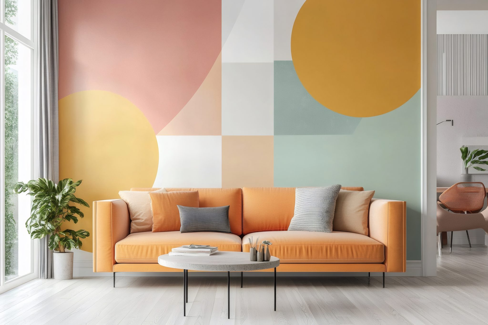
Geometric patterns
Geometric patterns are among the most striking trends in wall design in 2026. From hexagons and triangles to graphic retro motifs, clear shapes create structure, rhythm and depth – turning even plain surfaces into eye-catchers.
Walls become a design element: colour accents set the scene for furniture, highlight hidden corners and emphasize the individual living style in the living room, bedroom or kitchen. Circles, stripes, diamonds, triangles and squares transform rooms into modern, personal retreats.
Tip for beautiful lines: Carefully mask the wall with masking tape and press it down firmly. First paint the edges in the wall paint, then leave to dry well. When applying the paint for the stripe afterwards, the tape prevents the paint from running underneath and the edges from fraying, so that the result is nice and clean.
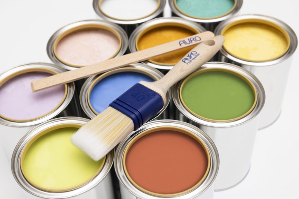
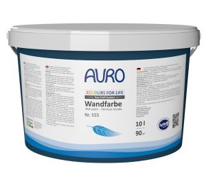
COLOURS FOR LIFE Premium wall paint, clay paint, varnish and wood stain
The best choice in terms of quality and sustainability: The COLOURS FOR LIFE line is characterized by the consistent ecological selection of raw materials and compliance with the strict AgBB criteria for emissions. These paints are particularly recommended for the home. All shades are easy to apply, have excellent coverage, are drip and splash resistant and ensure a perfect painting result. The colour shades are therefore emission-free and ideal for a healthy home.
Hard oil DuraQuick, wood floor oil - Six colour shades
Wood characterizes the room – DuraQuick protects it reliably. The new ecological hard oil combines a natural look with high durability, dries quickly and leaves a silky matt surface. Six shades in white, gray, black, oak, walnut and walnut are available for the design. The machine-applied COLOURS FOR LIFE system allows the floor to be selectively tinted – from light and restrained to dark and expressive. For living spaces with character and durability.
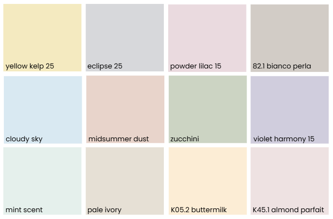
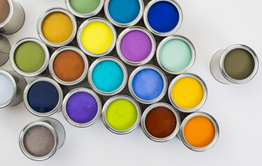
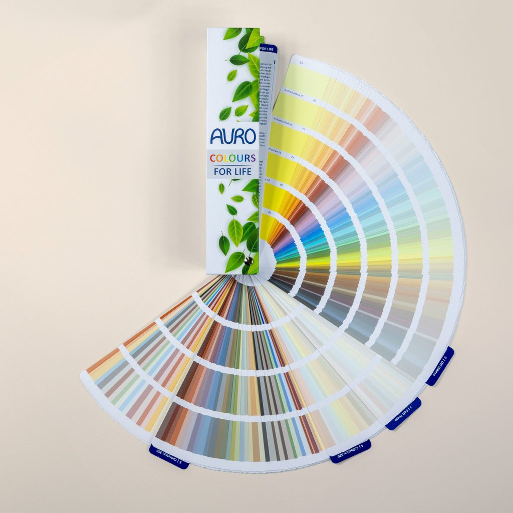
Colour selection in over 1000 shades
Select the COLOURS FOR LIFE shades with living examples and further information.
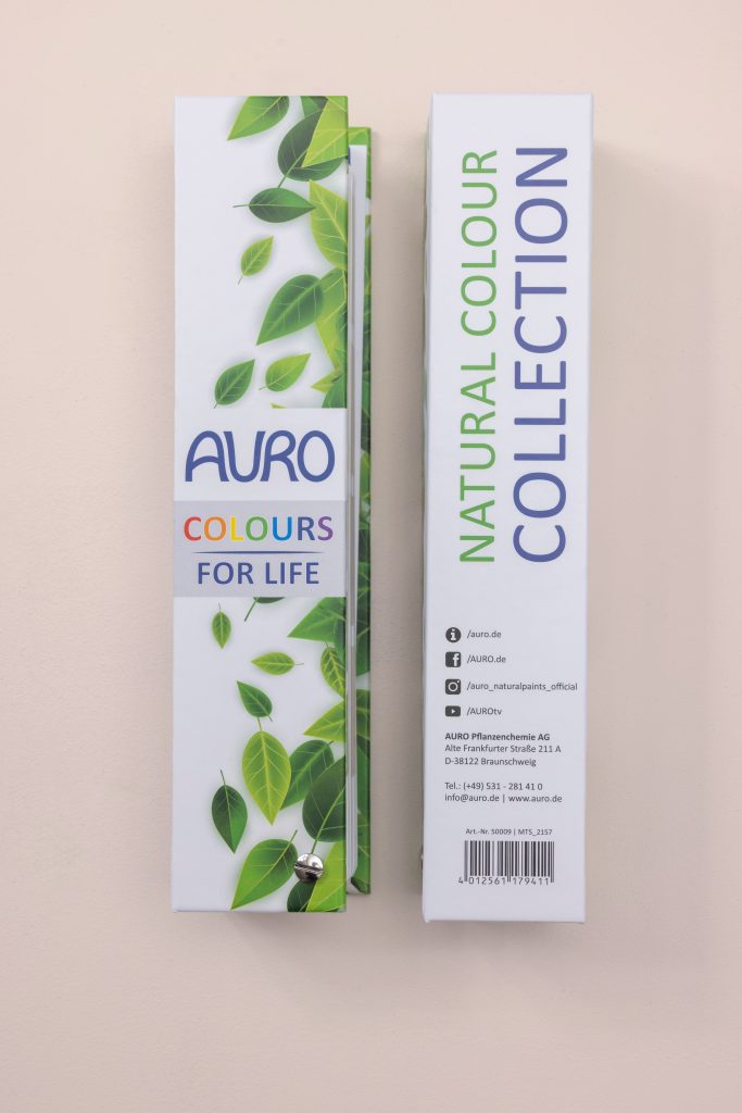
Colour fan on site at the dealer
You can also find all colours in the COLOURS FOR LIFE colour fan at your retailer near you.
AURO products
You can find more information and the full declaration on the product pages.
Wood floor oil in six colour variants
You can find more information and the full declaration on the product pages.
- Hard oil DuraQuick, wood floor oil
